Five ways to style your wedding table
Your wedding feast is the moment many of your guests have been looking forward to, and as such your wedding tables are a major focal point of your day. Deciding how to style it can be a little tricky as there’s a number of elements you’ll need to bear in mind: location, your overaching wedding theme or style, long or round tables, and the type of food you’ll be serving. One thing’s for certain: your menus and place cards should complement your overall style.
Here are some of my favourite wedding tables - I hope they inspire you for your on the day table styling!
Monochrome is always a winner, and these menus and placecards embellished with a subtle touch of gold are guaranteed to be a hit. Consider your placement, as this can make all the difference to your table styling: do you want it centred and on the plate, or do you want your tableware to speak for itself? Here we wanted to let the gorgeous ceramics shine, so set the menus and placecards elegantly to the side.
If you’re after a little more of a statement, you can consider custom shapes such as these sophisticated organic place cards. When using shape, be careful not to go overboard - less is definitely more here!
Playing with different textures can go a long way - I adore the pairing of the letterpress menus and beautiful, soft folded napkins alongside of the clear acrylic placecards and glassware. However you choose to lay out your table though, it’s important your guests can easily find their seat.
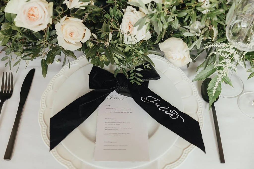
Want something a little more of a statement? How about a luxurious velvet ribbon embroidered with your guest’s name! They will be truly wowed by such a special place setting, and won’t be able to resist taking the personalised ribbon home with them.
And what if you don’t want separate menus and place cards? I find combining the two is such a perfect solution as it saves space on the table. These have become a fast favourite with Ink & Paper clients, offering both beauty and functionality.
Whatever you choose to to, remember that your menus and placecards can be an easy way to add a pop of colour and a splash of detail to your table settings. They work hard to bring your table styling together, and can make such an impact when you and your guests see your dining area for the first time.


